Blog
Methods for visualizing internal hidden states in Gated Recurrant networks
By Nick Barlow
Series: quickstart
When faced with a predictive problem involving time-series data, recurrent neural networks are a natural choice. For the recent project I have been working on which is predicting greyhound races using previous form data, the switch from a simple classic Feed Forward Neural Network (FFNN) to a Gated Recurrent Network (GRU) has drastically increased the performance achieved by the model. However one of the main drawbacks I’ve found is that GRUs are orders of magnitude more complicated, and as such can but harder to diagnose issues and to visualize.
In this post I’m going to go through some various methods I’ve used to create visualizations for models using this architecture. Most of the visualizations don’t add anything to explainability for model predication, but rather serve as an insight into how these hidden states change over the time series.
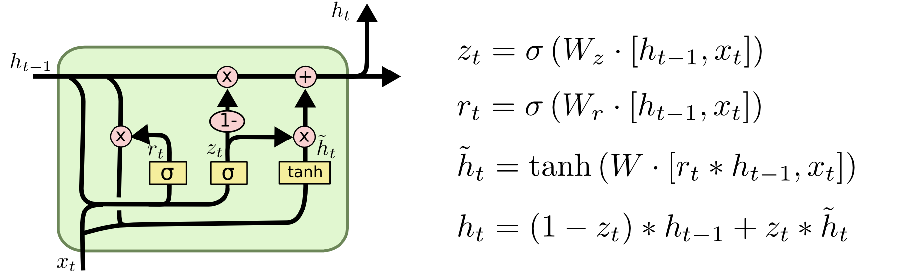
I won’t be covering the basics of GRU based networks, but for that there is already a fantastic blog post by Christopher Olah on the various structures of rnn’s commonly found here. But here is a diagram of the basic structure of a GRU cell, what we will be visualizing is ht.
Simple visualization of two different hidden states sequences
fig = make_subplots(rows=2, cols=1)

# Create a heatmap for the first step with constant scale
for i, dog_hidden_states in enumerate(hidden_states):
    heatmap = go.Heatmap(z=dog_hidden_states[0].tolist(), zmin=global_min, zmax=global_max, colorscale='Viridis')
    fig.add_trace(heatmap, row=i+1, col=1)

frames = []

# Iterate over dogs and their corresponding hidden states
for j in range(min_len):
    frame_data = []
    for i, dog_hidden_states in enumerate(hidden_states):
        hidden_state = dog_hidden_states[j]
        heatmap = go.Heatmap(z=hidden_state.tolist(), zmin=global_min, zmax=global_max, colorscale='Viridis')
        frame_data.append(heatmap)
    frame = go.Frame(data=frame_data, name=str(j))
    frames.append(frame)

# Define the slider
sliders = [dict(steps=[dict(method='animate',
                            args=[[f.name], {"mode": "immediate",
                                             "frame": {"duration": 30, "redraw": True},
                                             "transition": {"duration": 30}}],
                            label=f.name) for f in frames],
                active=0)]

# Update layout
fig.update_layout(
    updatemenus=[dict(type='buttons',
                      showactive=False,
                      buttons=[dict(label='Play',
                                    method='animate',
                                    args=[None, {"frame": {"duration": 30, "redraw": True},
                                                 "fromcurrent": True,
                                                 "transition": {"duration": 30,
                                                                "easing": "quadratic-in-out"}}]),
                                  dict(label='Stop',
                                       method='animate',
                                       args=[[None], {"frame": {"duration": 0, "redraw": False},
                                                      "mode": "immediate",
                                                      "transition": {"duration": 0}}])])],
    sliders=sliders
)

# Update frames
fig.frames = frames

# Display the figure
fig.show()
The visualizations you see above are heatmaps of the hidden states of a Gated Recurrent Unit (GRU) over time. Each subplot corresponds to a different dog, and the color of each cell in the heatmap represents the value of a hidden state at a particular time step. The darker the color, the higher the value of the hidden state.
The method used to visualize these hidden states is quite straightforward. We first run the GRU on the time-series data for each dog. At each time step, the GRU produces a hidden state, which is a vector of numbers. We collect these hidden states and arrange them in a 2D array, where each row corresponds to a time step and each column corresponds to a component of the hidden state. We then use this 2D array to create a heatmap, where each cell’s color is determined by the corresponding value in the array.
By looking at these heatmaps, we can gain some insight into how the GRU processes the time-series data. What’s particularly interesting is to compare the heatmaps for the two dogs. Even though the GRU is the same, the hidden states it produces can be quite different, depending on the input data. This shows that the GRU is able to adapt its internal representation to the specific characteristics of each dog. For example, if one dog tends to be faster than the other, this might be reflected in the hidden states.
However, it’s important to note that these hidden states are only a small component of the early model, and no real information about how these influence the final model predictions can be visualized at this stage. What we are aiming for here is to show how these two different sequences, despite starting at the same initial state, deviated away from each other over time.
Let’s have a look and see if we can visualize the rate of change of these hidden states as they progress.
In the diagram above I’ve added a simple lineplot that charts the absolute sum of the hidden states and how that progresses over the course of the sequence. As we can see the chart seems to plateau after around 20 steps in the sequence, and then from there it hovers around the same mark. While just looking at the absolute sum is an overly simplistic measure, we can use it as a simple stand in for available information and entropy of the system while looking at how it develops over time.
Some further points to look to for this would be some comparisons between two classes of cases, one where all the hidden states have been fully “saturated”, and the other with none or only some saturation. Comparing between different metrics like loss, accuracy, reproducibility and resilience to data issues. On that last point I assume that when we are in the early stages of a sequences of a dogs races, the model will be relying more heavily on the data at the current time-step and hence will have some issues with resilience when facing data issues.
I’ll be looking into these issues and some more in some coming blog posts.